
Benjamin Moore’s 2026 Colour Trends
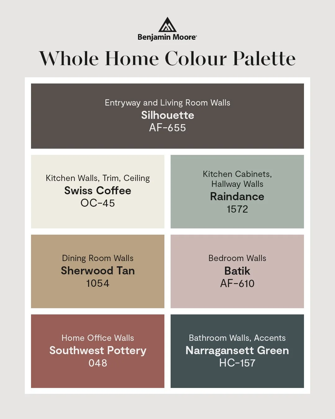
Benjamin Moore Colour Palette Of 2026
There’s something special about a fresh coat of paint in January. The days are bright with snow, the light is soft and reflective, and most of us start dreaming about making our homes feel warmer, calmer, and more “us.” Every year, colour trends give us a new lens to look at our spaces, but the best colours are always the ones that make your home feel lived in, loved, and welcoming.
Benjamin Moore’s Colour Trends 2026 palette is rich, grounded, and quietly elegant. It leans into warm neutrals, earthy tones, and refined depth. At Eastside Paint & Wallpaper, we’re seeing 2026 shape up to be a year of comfort, warmth, and personality. The colours people are gravitating toward aren’t flashy or loud. They’re thoughtful. They feel grounded. They work beautifully with Saskatoon light, prairie winters, and the way real families actually live.
These 2026 colour trends aren’t about following rules. They’re about helping your home feel like a place you’re excited to come back to every day. Here’s what we’re loving this year, and how you might bring it into your own space.
Let’s walk through what 2026 looks like, room by room, inspired by the palette you see here.
First, The Colour of the Year: Silhouette
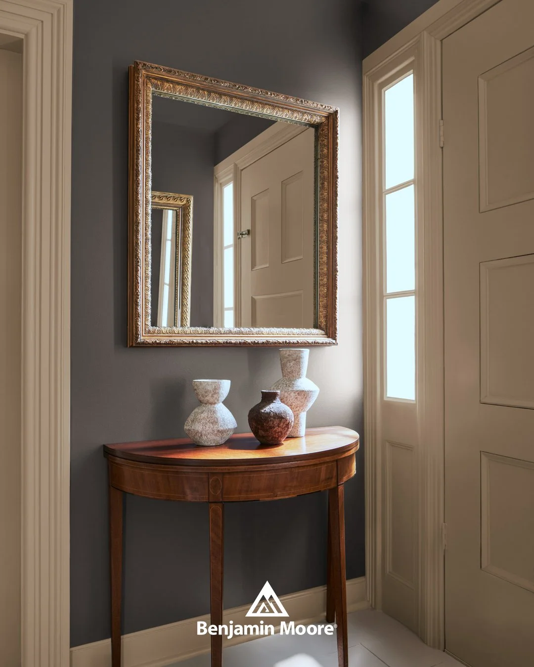
The deep, refined shade at the heart of the 2026 palette is Silhouette AF-655, Benjamin Moore’s Colour of the Year for 2026. It’s warm, grounded, and full of depth.
In Saskatoon, where winter light is often scarce, Silhouette adds necessary warmth instead of draining it. It pairs effortlessly with natural textures like wood, linen, and leather, as well as soft blacks and warm whites. Through the long Prairie winters, this rich shade creates an intentional, elevated atmosphere that invites you to slow down and feel at home.
This is the kind of colour that makes you slow down when you walk in. It makes a home feel intentional, calm, and inviting.
A Softer Way to Go Neutral
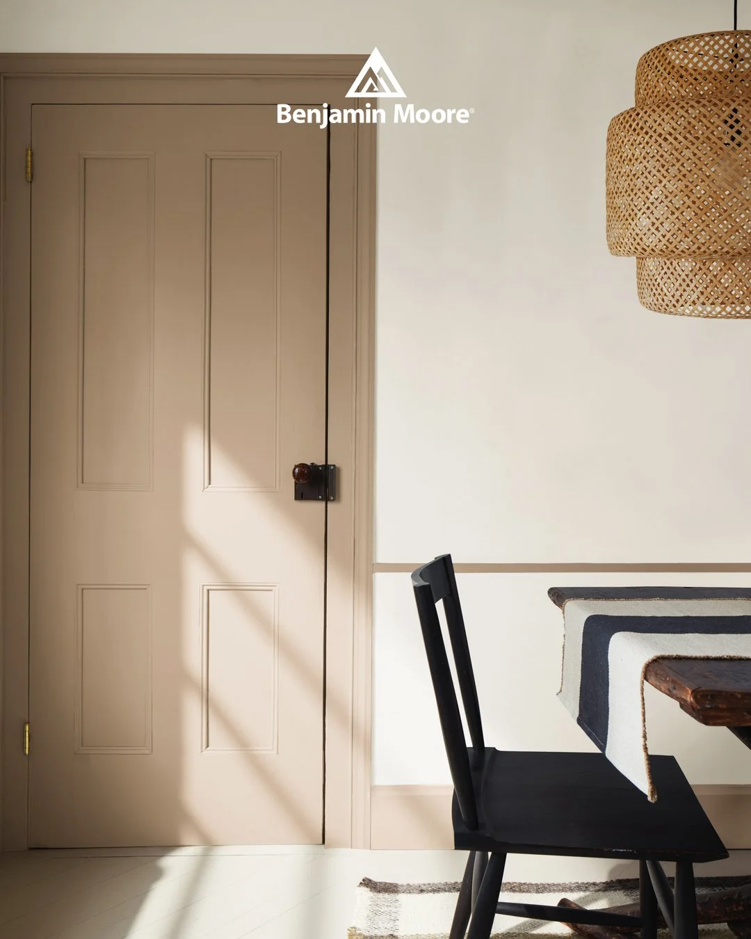
While white remains a staple, 2026 marks a shift toward gentle creams and warmer tones. Instead of stark, cool whites, people are choosing tones that feel calm and cozy, especially in Saskatchewan’s bright winter light.
Swiss Coffee OC-45 is one of those colours that does everything right. Unlike cooler whites that can turn flat or grey in winter light, Swiss Coffee stays warm and creamy, even on Saskatoon’s cloudiest days. It reflects natural light gently instead of bouncing it harshly, which makes rooms feel brighter without feeling clinical. Used on walls, trim, and ceilings, it creates a soft, seamless envelope that feels calm and inviting.
Swiss Coffee is the kind of white that makes a space feel like the heart of the home. It pairs beautifully with wood tones, woven textures, black or bronze hardware, and natural materials. Whether your style is modern, farmhouse, or somewhere in between, it gives you a warm, flexible foundation that works in every season.
In the image, you can see how Swiss Coffee beautifully wraps the space, from the door and trim to the surrounding walls and ceiling. This creates a clean, unified look that lets furniture, lighting, and textures stand out. It feels classic, but not dated. Fresh, but not trendy.
Green Is Still Popular, But Smarter
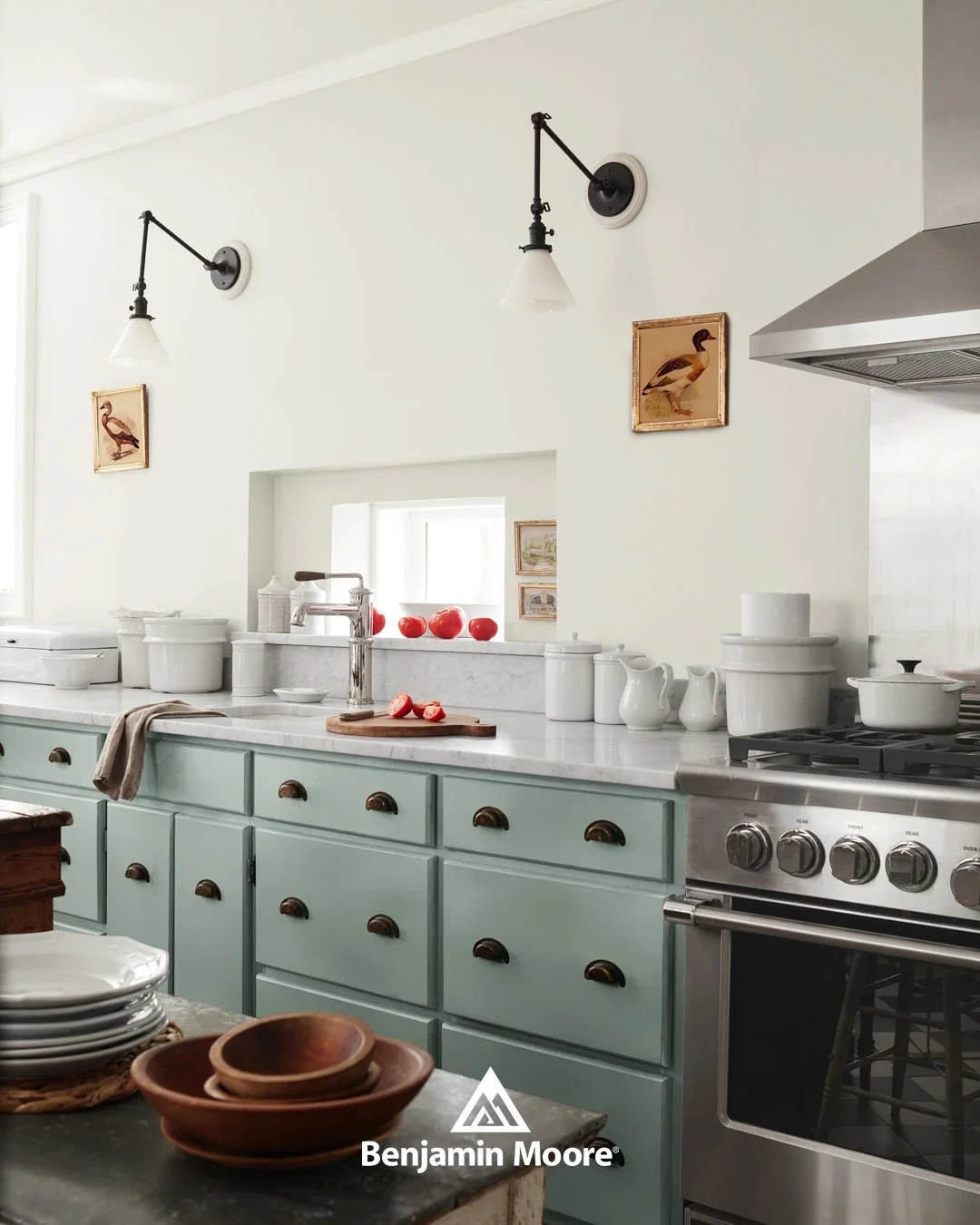
Raindance shows the lighter, airier side of green in the 2026 palette.
Raindance has a misty, peaceful quality that feels easy to live with. In kitchens, it’s beautiful on cabinetry, especially when paired with light counters, warm wood, and simple hardware. It adds colour without overwhelming the room and ages really well. In hallways and connecting spaces, it creates a gentle transition between rooms instead of a sharp contrast. This is the kind of colour that works just as well in a sunny summer kitchen as it does during Saskatoon’s long winter months, when natural light is softer and more muted.
We’re seeing people in neighbourhoods like Nutana, Haultain, and Varsity View lean into these softer greens. They work beautifully in character homes, but they also look just as good in newer builds that want a bit more warmth and personality.
Green like this feels good to live with. It’s not trendy in a way that will feel dated in two years. It’s timeless, bringing a sense of calm, clarity, and quiet confidence to everyday spaces. Instead of stealing attention, it supports the room, giving it a peaceful rhythm that makes the space feel easy to live in.
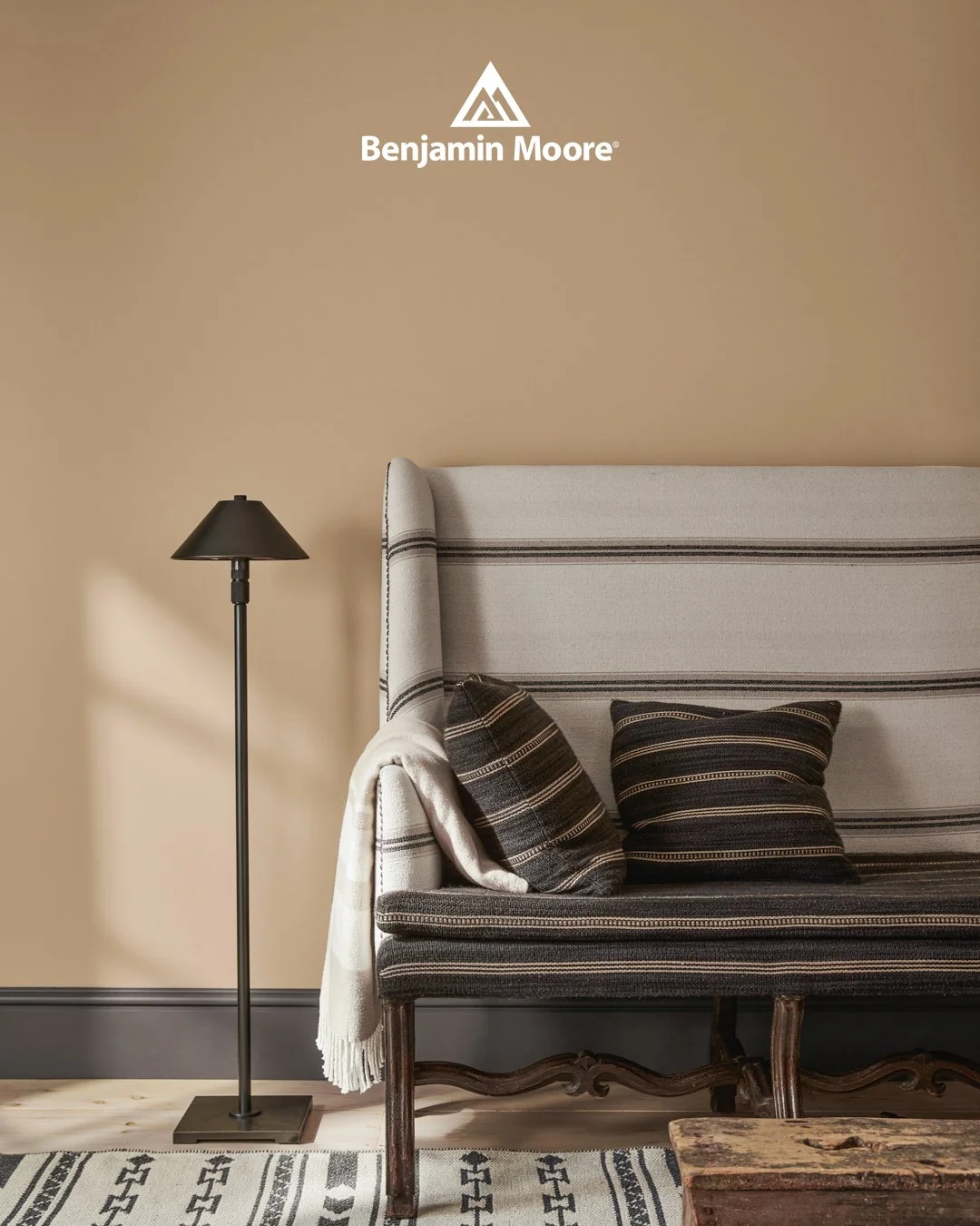
Warm Tans and Soft Earth Tones
Gray is slowly stepping aside, making room for warmer, earthier shades. Tans, clays, and sandy tones are having a big moment, and for good reason. They make rooms feel grounded and calm.
Sherwood Tan 1054 brings a sense of depth and comfort to rooms. In the 2026 palette, it’s used on dining room walls, but it works beautifully anywhere you want a space to feel welcoming, grounded, and lived-in.
Sherwood Tan wraps rooms in a soft, earthy warmth. It leans golden without feeling yellow, and rich without feeling heavy. It’s warm without being orange. Soft without being dull. This is the kind of colour that makes furniture, textiles, and wood tones feel more intentional. Dark floors, vintage pieces, woven rugs, and layered fabrics all feel at home against it.
In Saskatoon homes, Sherwood Tan shines in winter light. When days are shorter and skies are grey, this colour adds its own warmth, making rooms feel cozy without closing them in. It glows during the day and feels inviting in the evening, especially in spaces where people gather, like dining rooms, sitting rooms, or reading corners.
If you’ve been nervous about colour but bored of gray, this is a great place to start. Sherwood Tan feels timeless. It doesn’t chase trends, but it fits beautifully into them. It’s the kind of colour that looks like it has always belonged there, even in a newly painted room
Colour That Feels Playful (and Grows With You)
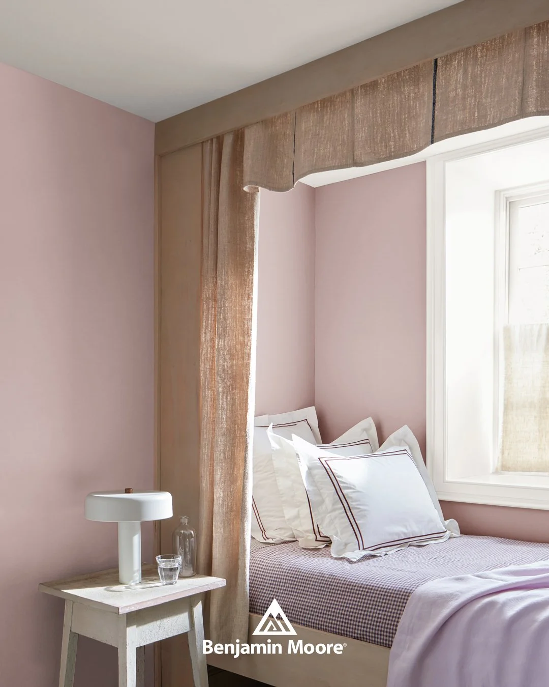
Not every space has to be serious. One of our favourite 2026 trends is using soft, happy colours in kids’ rooms, nurseries, and playful spaces, without making them feel childish.
Batik is a perfect example. It’s a soft, dusty pink that feels gentle and cheerful. In kids’ bedrooms, it creates a space that feels safe, warm, and sweet, but not overly themed. It works just as well with neutral furniture as it does with colourful accents.
Parents love this kind of colour because it grows with their kids. It works for toddlers, school-age kids, and even teens with the right decor. Paired with white trim, soft bedding, and natural wood, it feels fresh and comforting. It’s playful without being loud, and calming without being boring.
This is a colour that makes a bedroom feel safe, peaceful, and loved. It never feels harsh, which makes it ideal for spaces where rest and calm matter.
A Colour That Makes Everyday Spaces Feel Special
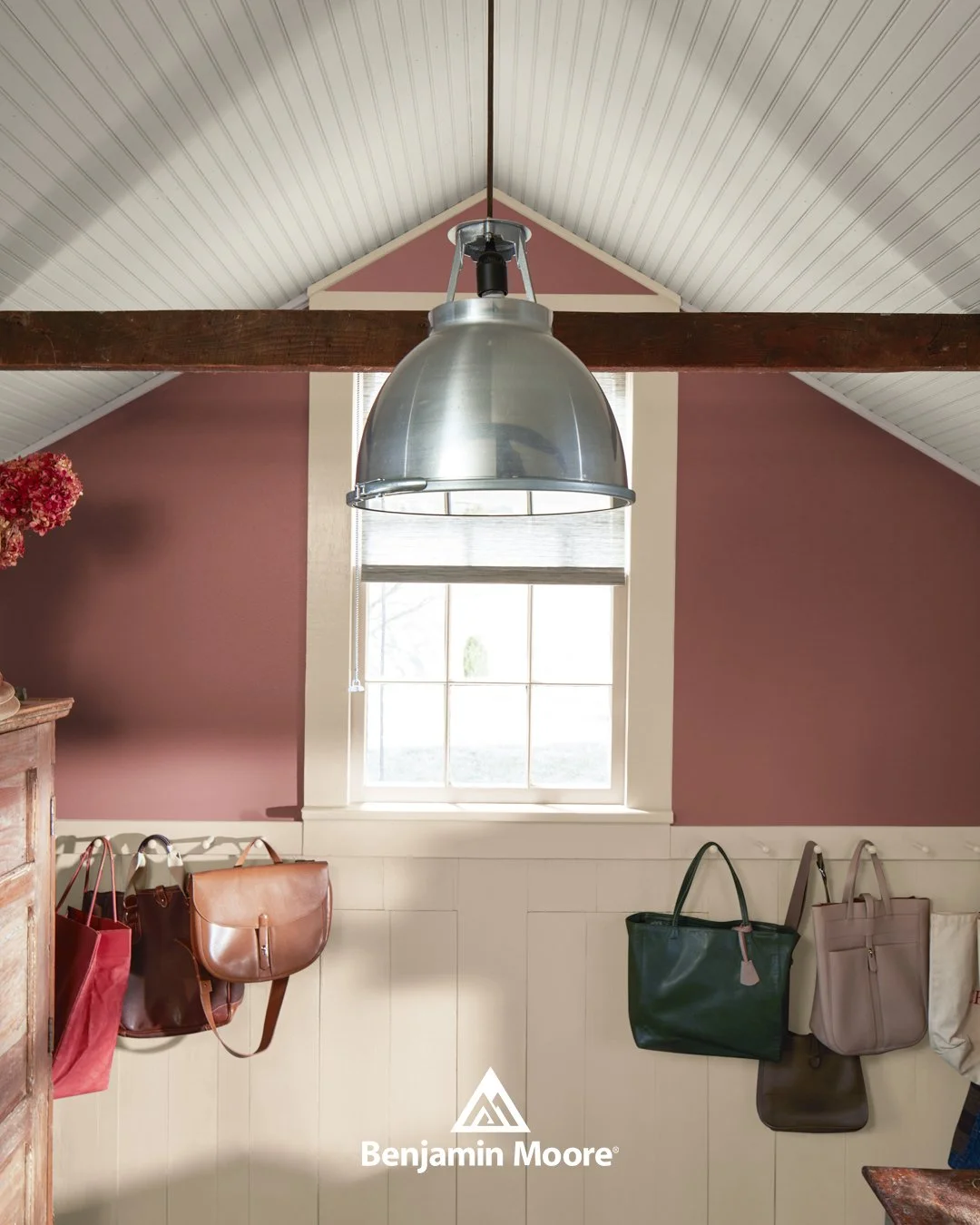
Mudrooms and entryways are finally getting the attention they deserve. These are the first spaces you see when you come home, and the first impression for anyone who visits you.
Southwest Pottery is a gorgeous choice for these hardworking areas. It’s warm, earthy, and full of character. In mudrooms, it pairs beautifully with white or cream panelling, wood hooks, and practical storage. It hides scuffs better than light colours and still feels inviting.
In Saskatoon, where boots, coats, and bags are part of daily life for most of the year, having an entryway that feels both functional and beautiful makes a big difference. This kind of colour makes even the messiest days feel a little more put together.
It’s surprisingly versatile. Even in newer communities like Stonebridge, Evergreen, and Rosewood, Southwest Pottery adds warmth and personality to modern layouts. It helps newer homes feel less stark and more lived-in, especially in spaces like entryways, home offices, and back entrances that are used every day.
Whether you use it in a home office, a mudroom, or a creative space, Southwest Pottery makes everyday routines feel a little more thoughtful. It is warm, inviting, and expressive, perfect for spaces that deserve both beauty and function.
Deep Color Done Thoughtfully
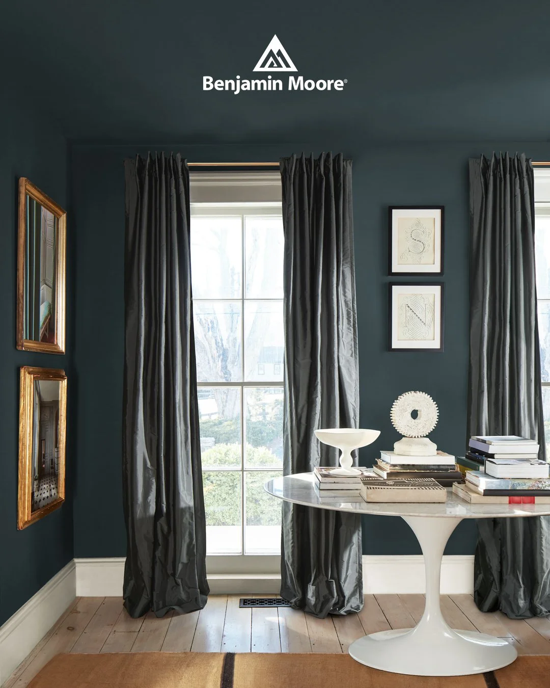
Deep colours are still trending, but in a more thoughtful way. Instead of heavy blacks or harsh dark grays, 2026 is about rich, deep colours that still feel warm and livable.
Narragansett Green HC-157 brings richness without drama. In the 2026 palette, it’s used on bathroom walls and accents, but it translates beautifully to living spaces, offices, and reading rooms like the one shown here.
In the image, Narragansett Green wraps the room in a deep, moody tone that still feels soft. It absorbs light in a gentle way, creating a calm atmosphere instead of a dark one. Paired with crisp white trim, warm wood floors, and natural textures, it feels elegant without being formal.
Used thoughtfully, even in smaller rooms, Narragansett Green doesn’t swallow a space. It gives it a mood, a softness, and a feeling of being truly finished.
In Saskatoon, this works beautifully in neighbourhoods like Caswell Hill, City Park, and parts of Nutana, where homes often have cozier rooms. These smaller rooms are perfect for reading nooks, home offices, dining rooms, or quiet sitting areas. In spaces like these, a rich colour turns a smaller room into a destination instead of just another room.
It’s perfect for rooms where you want to slow down. Reading corners, offices, powder rooms, or quiet sitting areas all benefit from this kind of colour.
How These Paint Colour Trends Work in Real Saskatoon Homes
Trends are fun, but what really matters is how colour feels in your actual home. Saskatoon has unique light, strong seasons, and a mix of beautiful older homes and modern builds. That’s why choosing paint isn’t just about picking a colour you like online. It’s about how it looks in your space, with your light, and your life.
That’s what we love helping with at Eastside Paint & Wallpaper. We don’t just sell paint. We help people feel confident about their choices. Whether you’re in Evergreen, Stonebridge, Lakeview, or Riversdale, every home is different, and every colour behaves differently in each one.
Bringing in photos, samples, or just your ideas is always a great place to start. We’re happy to talk through what you love, what you’re unsure about, and what will actually work in your space.
Bringing 2026 Colour Trends Home
If you’re thinking about refreshing your home in the new year, this palette gives you a beautiful place to start.
If you’re feeling inspired, we’d love to see you in store. Come explore these colours in person, see how they look in real light, and talk through your ideas with our team. We genuinely want you to love your home, and we’re always happy to help you get there.
We can also help you pair these colours with wallpaper, window coverings, and finishes that make everything feel complete.
Come visit Eastside Paint & Wallpaper and see what the 2026 Benjamin Moore Colour Trends could look like in your space.